
Rotating Words
Look Demo
Create a group of words that rotate in a continuous cycle. This plugin uses css editor and works with all template families.

How To Install
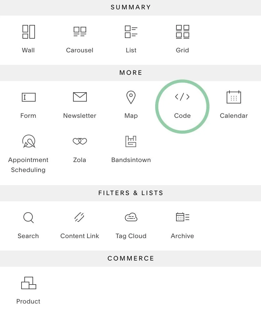
Edit the specific page you’d like the rotating words on and add a code block.
Copy and paste the following code to the code block.
<h1>
  <span>1ST LINE TEXT HERE<br/>2ND LINE TEXT HERE</span>
  <div class="rotating-words rotating-words-1">
    <span>ROTATING WORD 1.</span>
    <span>ROTATING WORD 2.</span>
    <span>ROTATING WORD 3.</span>
    <span>ROTATING WORD 4.</span>
    <span>ROTATING WORD 5.</span>
  </div>
</h1>
Replace both of the 1ST LINE TEXT HERE and 2ND LINE TEXT HERE with the text that you DO NOT want rotating.
Next, add the text you DO WANT rotating by replacing ROTATING WORD 1-5. Each rotating word should be different.
This code currently supports up to 5 rotating words, but you can remove if you need less.
Once you add in your text, it should look something like this:

When you’re done, save the page and go to the Custom CSS Editor. Copy and paste the code below into the Custom CSS Editor box.
// Rotating Word 1 //

.rotating-words-1 span:nth-child(2) {
    -webkit-animation-delay: 5s;
    -moz-animation-delay: 5s;
    -o-animation-delay: 5s;
    -ms-animation-delay: 5s;
    animation-delay: 5s;
    color: #4FEAAB;
}

// Rotating Word 2 //

.rotating-words-1 span:nth-child(3) {
    -webkit-animation-delay: 10s;
    -moz-animation-delay: 10s;
    -o-animation-delay: 10s;
    -ms-animation-delay: 10s;
    animation-delay: 10s;
    color: #4FEAAB;
}

// Rotating Word 3 //

.rotating-words-1 span:nth-child(4) {
    -webkit-animation-delay: 15s;
    -moz-animation-delay: 15s;
    -o-animation-delay: 15s;
    -ms-animation-delay: 15s;
    animation-delay: 15s;
    color: #4FEAAB;
}

// Rotating Word 4 //

.rotating-words-1 span:nth-child(5) {
    -webkit-animation-delay: 20s;
    -moz-animation-delay: 20s;
    -o-animation-delay: 20s;
    -ms-animation-delay: 20s;
    animation-delay: 20s;
    color: #4FEAAB;
}

// Rotating Word 5 //

.rotating-words-1 span:nth-child(6) {
    -webkit-animation-delay: 25s;
    -moz-animation-delay: 25s;
    -o-animation-delay: 25s;
    -ms-animation-delay: 25s;
    animation-delay: 25s;
    color: #4FEAAB;
}

// Rotating Words //

.rotating-words{
    display: inline;
    text-indent: 10px;
}

.rotating-words-1 span{
    position: absolute;
    opacity: 0;
    overflow: hidden;
    color: #6b969d;
    -webkit-animation: rotateWord 25s linear infinite 0s;
    -moz-animation: rotateWord 25s linear infinite 0s;
    -o-animation: rotateWord 25s linear infinite 0s;
    -ms-animation: rotateWord 25s linear infinite 0s;
    animation: rotateWord 25s linear infinite 0s;
}


// Rotating Animation Keys //

@-webkit-keyframes rotateWord {
    0% { opacity: 0; }
    2% { opacity: 0; -webkit-transform: translateY(-30px); }
    5% { opacity: 1; -webkit-transform: translateY(0px);}
    17% { opacity: 1; -webkit-transform: translateY(0px); }
    20% { opacity: 0; -webkit-transform: translateY(30px); }
    80% { opacity: 0; }
    100% { opacity: 0; }
}
@-moz-keyframes rotateWord {
    0% { opacity: 0; }
    2% { opacity: 0; -moz-transform: translateY(-30px); }
    5% { opacity: 1; -moz-transform: translateY(0px);}
    17% { opacity: 1; -moz-transform: translateY(0px); }
    20% { opacity: 0; -moz-transform: translateY(30px); }
    80% { opacity: 0; }
    100% { opacity: 0; }
}
@-o-keyframes rotateWord {
    0% { opacity: 0; }
    2% { opacity: 0; -o-transform: translateY(-30px); }
    5% { opacity: 1; -o-transform: translateY(0px);}
    17% { opacity: 1; -o-transform: translateY(0px); }
    20% { opacity: 0; -o-transform: translateY(30px); }
    80% { opacity: 0; }
    100% { opacity: 0; }
}
@-ms-keyframes rotateWord {
    0% { opacity: 0; }
    2% { opacity: 0; -ms-transform: translateY(-30px); }
    5% { opacity: 1; -ms-transform: translateY(0px);}
    17% { opacity: 1; -ms-transform: translateY(0px); }
    20% { opacity: 0; -ms-transform: translateY(30px); }
    80% { opacity: 0; }
    100% { opacity: 0; }
}
@keyframes rotateWord {
    0% { opacity: 0; }
    2% { opacity: 0; transform: translateY(-30px); }
    5% { opacity: 1; transform: translateY(0px);}
    17% { opacity: 1; transform: translateY(0px); }
    20% { opacity: 0; transform: translateY(30px); }
    80% { opacity: 0; }
    100% { opacity: 0; }
}
Customize
The CSS for this plugin can get a little busy, so we sectioned off the CSS for each individual rotating word.
You can replace the #4FEAAB color values of each rotating word with the color codes of your choice.
Do not change any values to the Animation Keyframes.
Please note that the text can only be aligned to the left.
License
This plugin comes with an Unlimited Use License. View License Terms