
Turn Into Pill Button
Look Demo
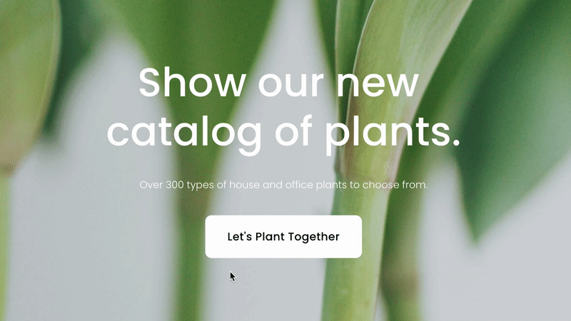
Turn any button block into pill shape when hovered. This plugin uses css editor and works with all template families.
How To Install
Add a button block to any page. You can set the size to whatever you like.
Once a button has been added and saved, go to the Custom CSS Editor. Copy and paste the code below into the Custom CSS Editor box.
// Square To Pill Button //

.sqs-block-button .sqs-block-button-element--medium {
  border-radius: 10px;
  -webkit-transition: ease-in-out 0.5s !important;
  -moz-transition: ease-in-out 0.5s !important;
  -ms-transition: ease-in-out 0.5s !important;
  -o-transition: ease-in-out 0.5s !important;
  transition: ease-in-out 0.5s !important;
}

.sqs-block-button .sqs-block-button-element--medium:hover {
  border-radius: 50px;
  -webkit-transition: ease-in-out 0.5s !important;
  -moz-transition: ease-in-out 0.5s !important;
  -ms-transition: ease-in-out 0.5s !important;
  -o-transition: ease-in-out 0.5s !important;
  transition: ease-in-out 0.5s !important;
}
Customize
The code works for the medium button block. If you want to modify a small or large button, replace all .sqs-block-button-element--medium text with either .sqs-block-button-element--small or .sqs-block-button-element--large.
You can adjust both of the border-radius values to your liking if you or keep as is.
License
This plugin comes with an Unlimited Use License. View License Terms